The meta part of the site:
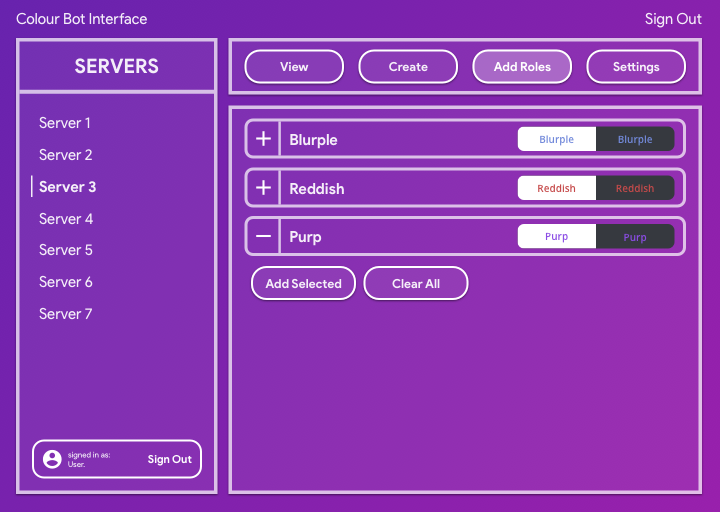
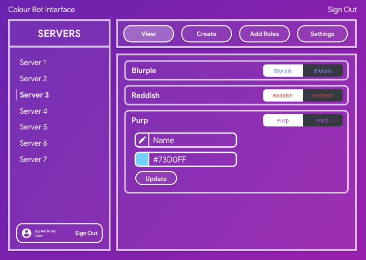
Normally, when I am developing my more complex single-page-applications, I like to mock up my designs in a UI/UX tool, such as Sketch. I learned how to use the Adobe suite during high school, out of both class requirements and a personal interest. I particularly like Illustrator and designing with vectors, and I seem to have a keep eye towards colour pallets, whitespace, visual interface flow etc. One example is from a discord bot I was writing:
For this website, I decided not to make a mockup/unified design language as the overall scope of the website is rather small. I was also unsure of what content and sections I would include in this website, so it would have been rather annoying designing for that unknown, and as this website is styled with a singular global css file, instead of the scoped per-component styling method I prefer to work with, I decided it would be easier to just iterate on the global stylesheet in order to reach my desired aesthetics.
I believe the overall design of this website fulfills a minimum expectation of what a modern website should look and feel like. As the overall content/scope of the website is very small, it follows that the design should be kept as minimnal as possible (except for the attention grabbing splash page), in order to ensure the website is performant, resizable and easy to read.
Structure and technical details
As the project specifications require a singular global
stylesheet, there are limited approches in how stylings can
be best organised in a matter that does not leak undesired
stylings across pages. One way that I have reduced the
overall global complexity is by scoping rules under a
main#page parent component. This means I can
scope classes to specific components under a
<main />, so in the instance of a
shared/repeated class name, styles from one page will not
leak on a different page.
At the start of the global CSS file, I have included a CSS
reset which is attributed below. This CSS reset is very
important when trying to design cross-platform websites.
Each individual browser vendor will include their own rules
and styles that may alter the look and feel of the website
in an undesired manner that might clash with existing design
language. Therefore, a CSS reset will remove all
margins/padding/borders from various components. Another bit
of very, very important code is the border-box property. For
legacy reasons, CSS defaults to the box-sizing model of
content-box, which is an absolute PITA to use, as borders
and padding are not included in the overall
height/width of the element, meaning that the padding/border
must be accounted for when trying to size and align
elements. This is just terrible and luckily CSS provides an
option to include borders and padding in the dimensions of
the element. This can be added with a wildcard selector
* { box-sizing: border-box; }. Wildcard rules
are typically considered bad practice (although the
performance impact is negligable nowadays, but it did have a
dramatic impact around a decade ago),
border-box is a typical usage of the wildcard
selector in order to ensure consistent and painfree styling.
In terms of semantic/DOM structuring, most pages are kept
very simple, with a copy-pasted header/navbar, a
<main> for each page, containing several
<section>s that provide a semantic layout
that can be parsed more easily with screen readers, and a
copy-pasted footer.
Aesthetics of this site
The aesthetic choices for this website represent a very
minimal and simple design language with most of the fancier
aesthetic choices featured in the home/index/splash page.
Typically the index/home page should be the most attention
grabbing in order for users to actually engage with the
content on your website.
Some light box-shadow is used in certain components and
sections in order to provide a sense of depth and context to
certain components. While aspects such as the box-shadow of
a component is seldom noticed, it does provide a more
cohesive and "nice" aesthetic, even if the user cannot pick
out these elements individually.
Other typical modern web-design choices are also present on
this site, typically small design elements such as not
having a pure white background and making text slightly less
real printed text. Another common element is the simple
padding around text such that the text content only occupies
around 75% of the screen on desktop and 95% on mobile. This
is to ensure that it is easy to read the textual content, as
reading from edge to edge gets very exhausting, which is why
many websites, especially ones focused around textual
content such as newspaper sites and Medium will employ this
same design rule.
One other lesser acknowledged design aspect is the
Typographical aesthetics. Sadly, as I cannot use an external
font, the overall capabilities of the system font means that
the difference between font-weight values is
not as dramatic/noticable as it would be a font such as
Sofia Pro. However, this does not mean that
font-weight cannot play a role in the aesthetic
visual flow of the website, as headers/subheaders/captions
all have deliberately set font-weight values.
Accessibility
A good web developer should always keep the accessibility of
their website in mind as they design and code their
projects. I am very guilty of not paying much attention to
this, mainly as my projects are typically very interactive
and dynamic apps that do not lead well to accessable
designs. Typically, a website should be easily parsable by
screen readers, which means some awareness of the various
aria tags and semantic properties is required. All pages of
this website have a score of 100 for accessibility according
to Google Chrome's Lighthouse report. The lighthouse report
is inherently limited in what it can actually check for, but
in general all images have been properly tagged with alt
descriptions, and are also within a
<figure> with a caption. The navbar is
also properly tagged with the
<nav role="navigation" > component, which
is refered to as a "landmark" role, allowing for screen
readers to understand what is actually on the page it is
parsing. Generally, a website as simple and static as this
one can be easily read and parsed by screen readers, and the
lack of distracting, annoying advertisements means the
website is also accessable to neurodivergent people such as
myself.
Attributions
| Name | Purpose | Source |
|---|---|---|
| Big CSS Reset | standardises CSS rules between browsers and rids of unwanted css styles on bare components. | http://meyerweb.com/eric/tools/css/reset/ |
| Bingus Cat | it's a silly photo of a silly cat. | http://bingus-superfan.tumblr.com |
| Hero background | nice little svg backgrounds, included in the big splash component with a fixed attachment for parallax | https://heropatterns.com |